The branding of AleSmith Crafted Ciders
Craft-beverage branding firm, CODO Design, goes into detail about working with AleSmith Brewing to brand its new line of hard ciders
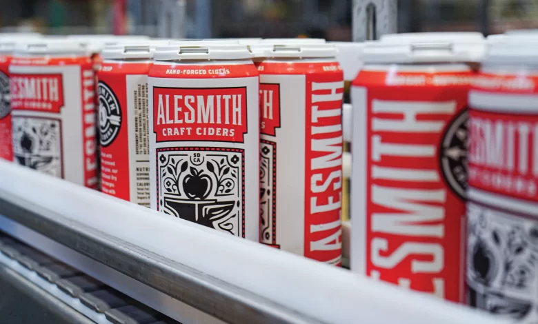
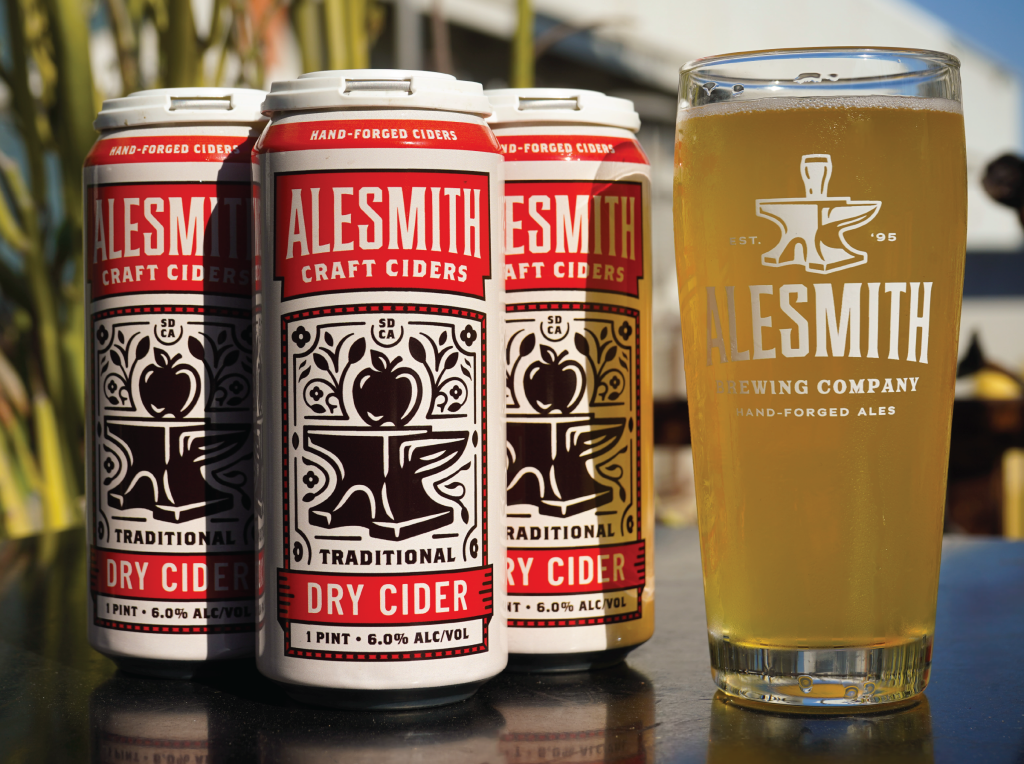
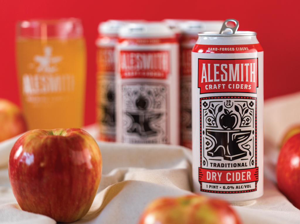
In October, Miramar’s AleSmith Brewing announced the launch of a packaged line of AleSmith Crafted Ciders. An extension of a brand that’s been well established over nearly three decades, its packaging felt in line with the company’s beer cans, while at the same time looking quite different. It’s an impressive balance struck by the branding experts at beverage-focused firm CODO Design. One of their aces was kind enough to provide readers a behind-the-scenes look at the process that went behind designing AleSmith’s cider line branding and how they worked with the company to get things just they way they wanted it and felt it would resonate best with their fans. It’s a rare peek behind an industry curtain that’s rarely pulled back.
How we helped AleSmith launch a hard cider extension
By Isaac Arthur, Partner, CODO Design
Founded in 1995, AleSmith Brewing is an iconic San Diego craft brewery. They’re also one of the largest brewing companies in the country, ranking 65th in 2023. AleSmith’s hard cider has been an in-house staple around their brewery for a while, and in early 2024 their team reached out to CODO Design to help brand, position and officially release this line in package. We’re going to give you a look behind the scenes at how this process played out, covering the following:
- Project context (brand Architecture, goals and constraints)
- Art direction (wrangling big ideas and moving parts)
- Initial sketching, revisions and finalizing everything for launch
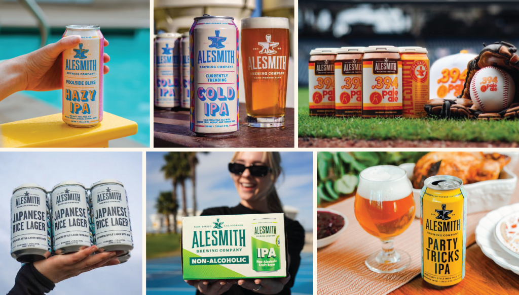
AleSmith Project Context & Brand Architecture
When deciding how to launch an extension, it’s important that breweries look at a few things:
- Broader Brand Strategy
- Brand Architecture
- Parent brand’s positioning
- Precedent for how a company has handled similar releases in the past (if applicable)
- Possibility of future growth and new product development that could blossom from this new product
After discussing and exploring all of these considerations with AleSmith’s team, we determined that their hard cider should land somewhere between a straight brand extension or a sub brand.
But why?
AleSmith has built a diverse branded house. Unless a new product comes along that dramatically breaks from their traditional approach (classic, balanced, true-to-style beers and products, decidedly no trend chasing), then it makes sense to keep their cider line under their branded house.
But how to extend their name? Would a “linked name” like CiderSmith be too much?
Yes. Yes it would.
We all felt that keeping the AleSmith name (and core logo) front and center would anchor this extension from a visual equity standpoint. From there, we could riff on their qualifier and tagline.
Some initial options we considered were:
- AleSmith Cider Factory — and the far simpler AleSmith Craft Ciders
- We also liked the subtle tagline shift: Hand-Forged
AlesCiders - And we knew we wanted to replace the glass on their iconic anvil logo with an apple
With these broad strokes in place, we began working through art direction to make sure we understood exactly what the AleSmith team was envisioning and how this could all come together to stand out from the rest of their competitive set.
Art Direction & Mood Boards
Once we had our initial parameters in place, we were able to jump right into mood-boarding. (Note: This is a lighter touch, faster exercise than formal brand strategy and really only works when a brewery has an established brand strategy and attractive brand identity. AleSmith came to the table with both of these things in place, which meant we could focus more on their cider’s look and feel and move fast.)
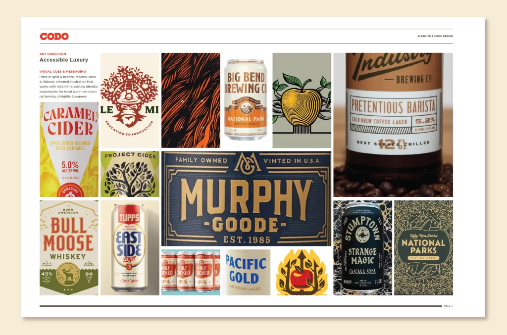
We developed three mood boards (collages to art direct what AleSmith’s cider line could look and feel like). Here are snippets of copy pulled from our presentation along with some additional notes on aesthetics and messaging:
- Clean & Classic: Clean and simple. Lots of white space. Confident, reliable and feels unmistakably like an AleSmith brand. This direction was the most congruent with their existing identity.
- Illustrative & Apple-forward: This direction tackles the goal of immediately reading as a cider instead of a beer. We considered doing this with a subtle, tonal pattern to differentiate from the rest of AleSmith’s portfolio. (More on this idea here in a sec.)
- Accessible Luxury: This direction positions AleSmith’s hard ciders as premium as you can get without being a snob about it. But this idea was dressed down with more tried and true beer iconography (seals, ribbons, taglines, violators, etc.). Hints of gold and bronze, aged cream (versus stark white), and deep reds, browns and rich blacks. It was also slightly European, which felt right given AleSmith’s broader history and approach to new product development.
Revised Mood Board
The “accessible luxury” idea resonated with the AleSmith team. We were pretty close after this first look, so after some minor tweaks to the mood board (bringing in some of the patterning elements from the second direction, dialing down some of the more extreme quality cues, etc.), we were approved to begin sketching.
Initial Sketching
Here are a few points to highlight from our initial sketching.
1. Hierarchy was important: These cans had to immediately read as an AleSmith product, while at the same time clearly reading as being hard cider. It’s important for AleSmith fans to not mistakenly grab a cider, thinking it’s beer. And on the flip side, we need to tell AleSmith’s regular drinkers that this hard cider is good to go because it’s made by AleSmith.
2. Industrial vs. Traditional (on adhering to, and rising above, category canon): This was a dueling idea from our mood-boarding process. AleSmith has an enormous production facility with acres of beautiful stainless tanks — someone called it a “Willy Wonka beer factory” during our initial research. And their internal team likes this sort of messaging as well. Here, “industrial” or “factory” doesn’t mean bland and mass market, but rather efficient, clean and rigorously made. So one of our directions leaned more into this idea while the other explored a more traditional look you might expect in the hard cider category — more texture, more organic detail and more provenance.
3. Riffing on their logo (and more hierarchy considerations): We knew we wanted to replace the glass in AleSmith’s iconic logo with an apple. This is a fun, if slightly on the nose way of immediately orienting someone looking at this packaging in a cold box — Ahh, it’s a hard cider!
This presented another hierarchy challenge: This is a subtle change, so we probably need to blow this thing up to be the main art on pack so people actually see it. But then, does that compete with the existing AleSmith logo? And the style (Imperial, Traditional Dry, etc.)? And the ABV (alcohol-by-volume) figure?
This balance doesn’t seem like that big a deal, but if you get it wrong, even slightly wrong, the entire composition can fall flat. This doesn’t just mean your packaging isn’t as beautiful as it could be, but that someone might be less inclined to pick it up and throw it in their cart when shopping. So getting this squared away is a big deal.
4. How to differentiate within a branded house: One challenge you can run into when building a branded house is that, over time, it becomes harder to create entirely new, compelling packaging that doesn’t look like something you’ve previously released. This doesn’t mean the baseline design doesn’t work well, but functionally, there are only so many colors you can choose before your cans start looking similar to another existing SKU (stock keeping unit) or just unattractive (due to clashing colors).
This issue is exacerbated when using a monolithic branded house template, where everything looks nearly identical, save for color and copy changes. (e.g. Rhinegeist, Monday Night, Prost). For example: We can’t use that green because we used it on an LTO (limited time offering) can last spring. Or: This shade of red is too close to our hazy IPA.
This was an issue here because AleSmith has a diverse portfolio with hundreds of individual cans developed over the years. And at a quick glance, there’s not much obvious white space for their next release, beer or beyond.
One opening we saw within AleSmith’s broader portfolio — and their broader competitive set — was to use patterning as a focal point. Their cans all lean clean and classic, with their core logo front and center and a fanciful name and style across the bottom. There’s some variance here and there, but by and large, you know an AleSmith can when you see one.
These points, along with our refined mood board guided our initial concept development. We presented the work, the AleSmith team loved it and we moved directly into revisions.
Revisions
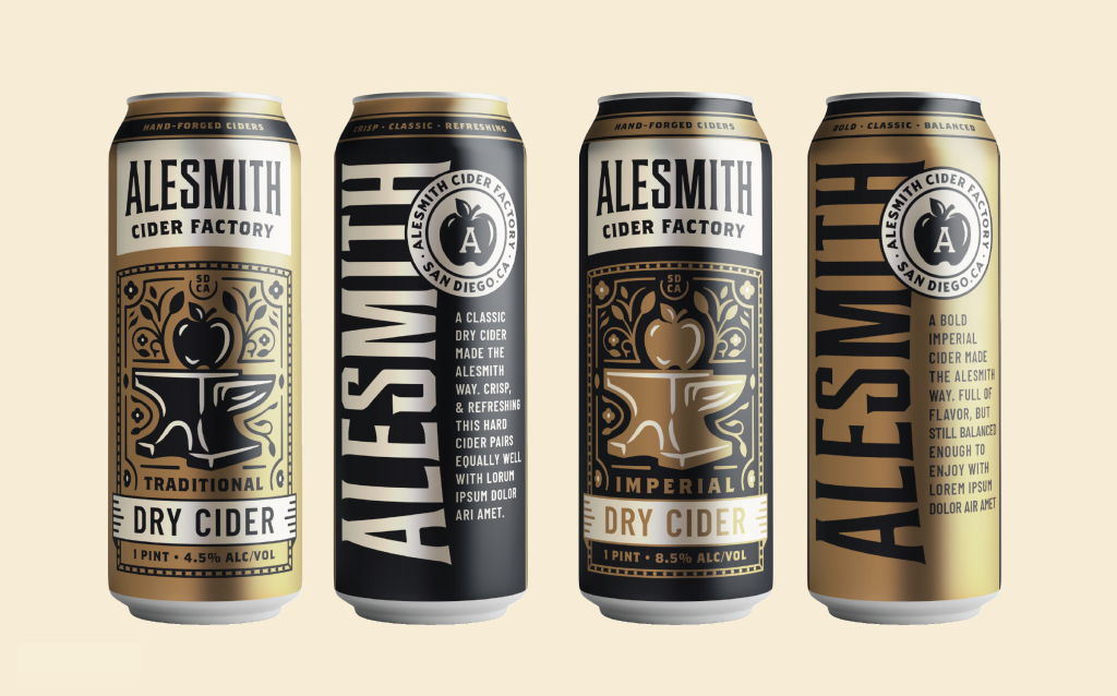
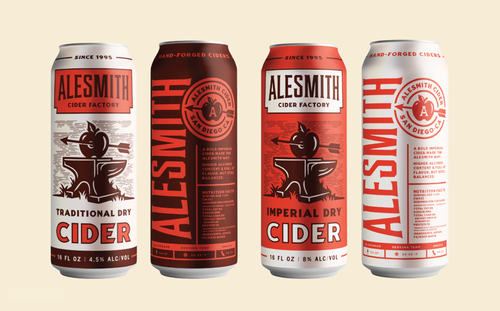
Our first presentation was so well received, that we really only had a few small points to iron out from the AleSmith team.
A few of these included:
- AleSmith wanted to add a dry-to-sweet scale as an easy reference for consumers
- They wanted to bring the banner logo lockup from Direction 2 into the first option
- They felt the dark imperial can was too heavy and looked undrinkable
- After seeing it, they decided that AleSmith Cider “Factory”, while fun, didn’t feel right in the cider space, so we went with the simpler “Craft Ciders” qualifier
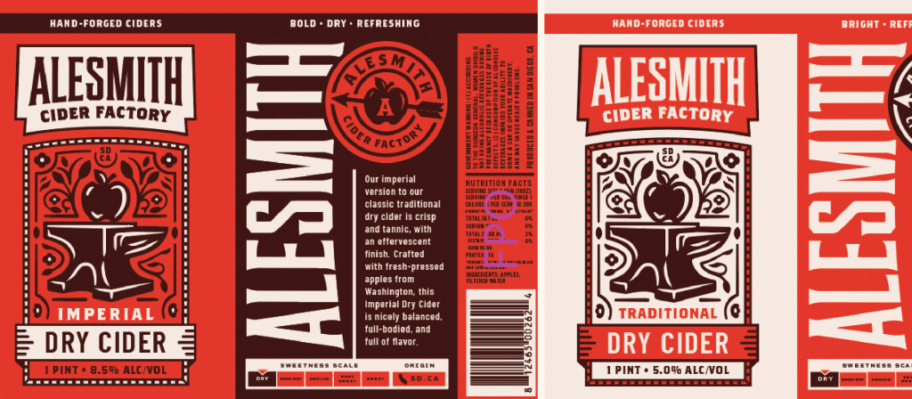
Beyond that, most of what we continued to tweak over the next few weeks was small stuff that we wanted to resolve in order to get this up to CODO’s standard. So lots of small details that no one other than our team will ever notice like:
- Simplifying the pattern and border line weights
- Getting the tri-color motif on the back panel to be more consistent from can to can
- Making sure the sweetness scale reads clearly at a small size
- Restyling the nutrition-facts label so it’s not an eyesore
- Thinking ahead to how we’ll use colors on possible follow-on releases without breaking this clean system
Final Points
From here, we got everything wrapped up and saved out for production, but here are a few ideas to end on:
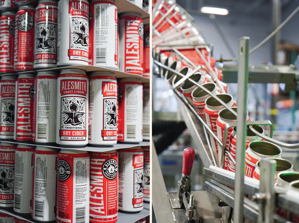
1. Earn your keep: AleSmith invested in design for this cider line, but is putting these out in four-packs of 16-ounce cans to start. Their team wants these ciders to earn their keep before investing in more expensive carton packaging. This is a smart approach. Starting lean and making sure you have something your fans actually want is a more conservative and realistic approach in today’s alcoholic beverage market. But for what it’s worth, I suspect you’ll see these in cartons by late 2025. These ciders are lovely and AleSmith has a great sales team bringing them to market. So stay tuned.
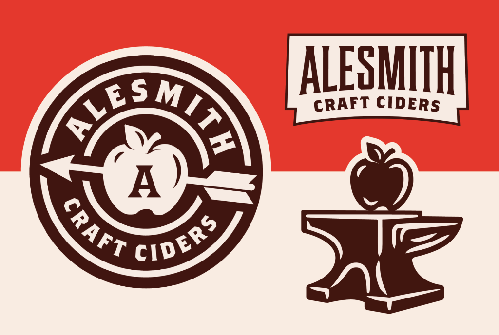
2. Secondary assets (getting more mileage out of your packaging): We developed a lot of cool elements on this packaging that lends itself to retail activation and merchandise. Some of this was by design, and some of it was by accident. These sorts of components are a clear deliverable when building a modular brand identity system. but it’s a good idea to keep an eye out for opportunities like this when working on packaging-only engagements. This helps you get more bang for your buck while making downstream promotion and marketing easier.
Wrapping up
We didn’t focus on it in this article, but another compelling angle to this product launch is how AleSmith is continuing to stay relevant as a 30-year-old brewery. Not to mention one in the hyper-competitive San Diego market. They’re doing this, not by chasing trends and throwing new products at the wall to see what sticks, but rather, through thoughtful innovation and launching new segments that feel right.
Think: “Should AleSmith launch X?” versus “Can AleSmith launch X?”
They’re leading with their brand here, and more legacy breweries should do the same.

