
Rebranding Mission
CODO Design shares insights on soon-to-debut brand update for Mission Brewery
Last year, the crew at Mission Brewery embarked on a many-months journey that’s readying to pull into port. Looking to usher the East Village interest into a new age, Mission’s owners and executives teamed with beer-centric creative firm CODO Design to take a hard look, not only its logo, packaging and other brand assets, but also the liquid it produces. The goal was to see how all of that synced with the company’s plans for the future and adjust as needed, keeping and elevating what already works while nixing anything that doesn’t and replacing those disparate or outdated items with fresh elements more in line with the current market and craft-beer industry in San Diego and beyond.
The resultant designs of this long and thoughtful process are about to be unveiled at Mission’s 15-year anniversary celebration, which will take place at its tasting room at noon on Saturday, July 30, and feature a slew of new offerings (Tailgate Series: Double West Coast IPA, Raspberry Peach Vanilla Sour, Gin & Tonic Extra Hard Seltzer, Hard Root Beer “Seltzer”). Ahead of that official reveal, we have some of the new designs along with an insightful creative brief provided by the team at CODO Design, who share key details of what they and the Mission team considered while endeavoring to update a brand dating back over a century.
REBRANDING MISSION
We’ve worked with several legacy breweries over the last few years that have found themselves at an inflection point—do you continue to carry on as-is, maybe tinkering with your portfolio a bit along the way (assuming things are going well), do you (gasp) sell the entire concern and ride off into the sunset or do you reinvent yourself so you can thrive in the future?
In 2020, with new leadership came a new direction for Mission Brewery, one of the standout outfits of the San Diego craft-beer scene…and one of the aforementioned legacy breweries. Several years of flat-to-declining sales followed by a pandemic-wracked market presented an interesting crossroads for the brewery: under new leadership, what opportunities exist to breath new life back into the storied brand?
With so much noise, well-earned clout and competition throughout California, in general, and San Diego, in particular, how might we reinvigorate a 100-plus-year-old brand to suit the needs of the contemporary scene while cutting through the din of competition?
To discuss this challenging brief, let’s first take a look back (way back) at Mission’s history…
Mission’s Background & Project Context
Founded in 1913 by intrepid German businessmen who saw an opportunity to capitalize on an exploding lager market, Mission Brewery was originally placed in an iconic facility off of Interstate 5 in San Diego, but an impending push for prohibition (paired with post war anti-German sentiment) caused the original Mission to shutter just five years later. While other breweries would eventually make use of this original facility, the Mission brand name would sit dormant for nearly 90 years.
In 2007 Mission was reborn and relocated into the historic Wonder Bread building in San Diego’s East Village neighborhood. Over the next 10 years, Mission grew into one of the largest craft breweries in San Diego. As the industry changed and competition grew, Mission lacked the long-term vision to effectively compete. As a result, the company went into a steep downturn.
With the new leadership in place there was an opportunity to get the brewery back to sustainable growth.
Named after the Spanish mission buildings constructed along the coasts of California, the name “Mission” evokes an inherent aspect of California history and its cultural fabric. The 2007 reboot logo, associated artwork and brand image for Mission Brewery revolved around a vaguely nautical, historic, swashbuckling aesthetic.
This iconography can be really fun (I mean, pirates!) but at the same time, everyone involved with the project admitted that it was starting to feel a bit dated and dusty in context. For one, not much thought had been put into consistency of the identity itself, resulting in a proliferation of confusing logo files and packaging that was a little busy, a little dull and easily overlooked in a cold box.
Brand Strategy
Looking at the brand at a higher level: What did this salty, hard-nosed aesthetic say about Mission’s beer and the company’s overall positioning? Does it make sense to cleave to such an aggro, quasi-sinister colonial look and feel? In a world of seltzers and RTDs (ready-to-drink cocktails) and better-for-you beverages, does the dark-and-surly aesthetic of the early craft-beer boom make sense in today’s market?
Through our audit and brand-strategy work, we determined that for the most part, no, it does not.
Ultimately, our team decided that it would be a much stronger fit to associate the brand with the local community itself. Our task was to lift Mission out of the Old World and into the new, evoking the color, energy and vibrancy of the San Diego scene as it is today while sprinkling in just enough of that charming vintage aesthetic to let you know that this brand has been around for a while.
This thinking informed our brand refresh from top to bottom.
Brand Identity
After wrapping up the brand-strategy phase, we tackled a comprehensive identity overhaul; an exercise in weighing existing visual equity against broader project goals.
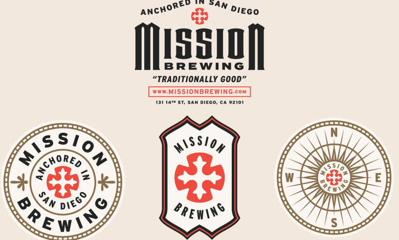
A refreshed brand mark emerged from this process, which allowed us to preserve the iconic red Spanish cross, albeit with a fresher and warmer presentation.
And we’re particularly proud of working in authentic Mission architecture style design cues into the typography where possible, to reinforce the history and provenance behind the brand. Consider this phase as a balancing act achieved through hours of tweaking and comparison. Does the new typography/mark maintain that iconic “Mission” feel, while striking a fresh, relevant note at the same time?
Incidentally, we made a subtle change from “Mission Brewery” to “Mission Brewing.” Nitpicking, perhaps, but considering company goals to eventually open satellite locations, it made sense to tweak this naming convention while we were working under the hood.
Package Design
This first wave of package design is purpose-built to reintroduce Mission Brewing to the market, and to help customers become acquainted with the revived look and feel. Bold colors and a clean, minimal composition come together in a flagship template that allows new SKUs (stock keeping unit, different products produced under the Mission brand) to be easily whipped up when necessary.
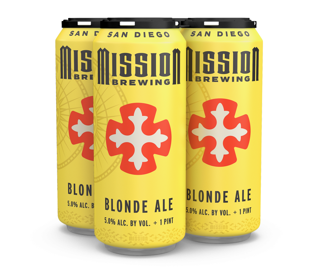
For long-time fans, we stayed true to some design cues from the original Shipwrecked IPA, by bringing in that original skull and black/red/white color scheme. The rest of the flagship lineup reflects a more modern and market-aware mix of beer styles with vibrant color cues to match. The intention here is to pique the interest of drinkers who are either new to Mission, or completely uninitiated to craft beer itself.

Mission’s portfolio received a revamp, as well, including a few more current styles and formats (six-packs of 16-ounce cans as well as 19.2-ounce cans to drive single-serve trial and get into sports and concert venues throughout San Diego).
An Important Note
If a brewery is considering a rebrand due to any of the issues we’ve mentioned here—increased competition, flat or declining sales, not understanding its own story or purpose, etc.—it’s important that the organization look at its beer first!
Branding is obviously important, but if a company’s beer isn’t as good as it can be, or exciting enough, or on-trend enough, then a rebrand might not move the needle. Brewery’s must set their ego aside and be open to changing their portfolios as needed (styles, formats, individual brands, etc.).
We’ve worked with several breweries that have viewed their rebrand as an opportunity for some heavy-duty housekeeping. Changing or adjusting distributor relationships (where possible), shifting how they approach chain retail sales, how they conduct field marketing, etc. If handled correctly, this process can serve as a hard stop and reset for how a brewery runs its business.
In Conclusion
Inheriting a brand with a long history like Mission is a balancing act. Recognizing which elements to honor and keep, and which to jettison can be an overwhelming exercise, but whenever we have the opportunity to work with a brand with such good bones, both as beer geeks and design nerds, we get very, very excited. In this particular case, Mission’s team brought their forward-looking vision to the table, and the resulting work is better for it.