In March, when the founders of 17-year-old brewing operation, The Lost Abbey, divided the multifaceted business, its flagship brand went to managing partner, Tomme Arthur. The Belgian-inspired, monastic and barrel-aged ales he’d crafted while working at Pizza Port were the inspiration for that company’s owners, Gina and Vince Marsaglia, teaming with him to form The Lost Abbey in 2006. In doing so, they set up a sister-brand called Port Brewing, which packaged and distributed hoppy and otherwise SoCal-style beers tracing back to Pizza Port’s family of local brewpubs.
Port Brewing’s portfolio now belongs to the Marsaglias (along with The Lost Abbey’s former headquarters in San Marcos and its other former sub-brand, The Hop Concept). That includes the brand’s all-time best-selling beer, Mongo double IPA, which has been brewed at Pizza Port’s production facility in Carlsbad’s Bressi Ranch development since last year. All the while that hoppy workhorse has been packaged in orange cans bearing the Port Brewing logo…until now.
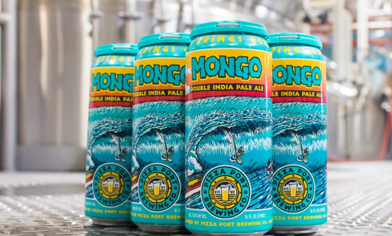
Feeling the time was right, the Marsaglias have transitioned Mongo into Pizza Port’s portfolio. In doing so, they employed longtime friend and local artist, Sean Dominguez, to draw up a can design matching its iconic beach-and-leisure motif. Having designed all the packaging art for Pizza Port and The Lost Abbey for nearly two decades it was a standard assignment, but considering Mongo’s popularity among local beer fans and the significance of bringing it under the Pizza Port umbrella, a high-stakes air loomed heavy over the redesign..
“Mongo has a long and impactful history, not only to Pizza Port but the San Diego craft-beer community,” says Pizza Port Senior Marketing Manager Joe Arguello. “ That added a sense of excitement and pressure we don’t typically experience when developing a label.”
With Mongo being such a celebrated beer, Arguello and his colleagues wanted to incorporate a sense of nostalgia that would resonate with its longtime fans and devotees, while creating a can design that matches the easily recognizable look and feel of its other labels. Looking back on Mongo’s past packaging sparked an idea that was passed on to Dominguez along with a handful of conceptual ideas.
“Mongo is a big beer with big flavor. We wanted to convey that through all aspects of the label,” says Aguello. “The design features a surfer riding out a big, powerful wave while characters admire him from boats. The typeface resembles a stone block, which we felt further connected the artwork to an 8% (alcohol-by-volume) double IPA.”
When asked about any fun Easter eggs hidden in the can art, Arguello points to a cat on a surfboard waiting to drop in. It’s a callback to the original Mongo artwork, which featured a surfing cat. That OG design was a nod to the feline the beer was named after. The real-life Mongo patrolled The Lost Abbey’s facility for years as its “Director of Pest Control”.
“We are really excited to see the label come to life and hope our fans are just as stoked about the new look as we are,” says Arguello.
Due to shipping delays, new cans of Mongo are not yet on store shelves, but will arrive at retail and Pizza Port’s sextet of brewpub locations within a matter of weeks.

